Daily Seoul: Building a unified brand ecosystem for a high-traffic food court
Project Type |
Grand SK (H Mart subsidiary) · Market Eatery Team
Timeline |
2025 - 2026
Tag |
Brand Strategy · Visual Identity · Art Direction · Environmental Design
Context
Building a brand from scratch, inside a food court
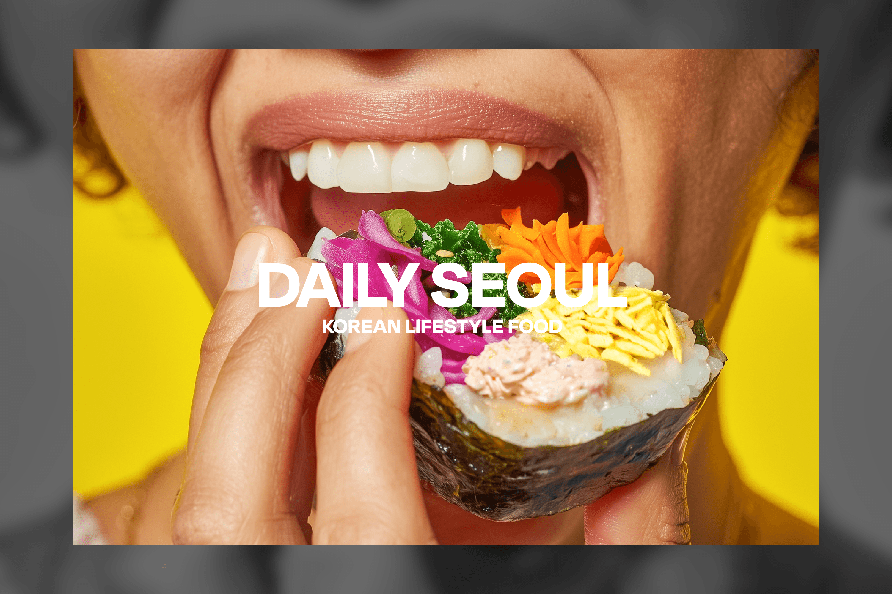
Daily Seoul needed to feel different: approachable to families and MZ generation customers, modern without losing its Korean identity, and eye-catching enough to stop foot traffic in seconds inside a busy food court.
My role
Sole designer - brand strategy, visual identity, environmental design, photography, social media, merchandise
Stakeholders
Restaurant owner, VP, company president, direct manager, team members - multiple voices, one visual direction
Challenge
Korean food that feels fresh, not familiar
Grand SK, an H Mart subsidiary, needed a new Korean food brand for its food court concept. As the sole designer on the Market Eatery team, I led every visual aspect of Daily Seoul, from naming direction and brand strategy to the physical space it lives in.
Constraint 1
Limited control over the physical space and had to make impact within fixed boundaries
Constraint 2
High foot traffic = 3~5 seconds to grab attention
Constraint 3
Multiple stakeholders with different tastes, needed one cohesive visual language
Brand direction & key decisions
Why it looks the way it does
Name - "Daily Seoul"
A place where Korean food is easy to reach, every day. Not a special occasion a daily habit. The name bridges Korean identity with an everyday, accessible feeling.
Target - Families + MZ generation
Korean food needed to feel welcoming to both a parent bringing kids and a younger customer discovering it for the first time. The brand had to speak to both without alienating either.
Color - Green & Yellow
Green anchors the brand in freshness and vitality, Korean food is alive, seasonal, and full of color. Yellow was chosen not as a contrast but as a companion: it softens the green's edge, adds warmth and appetite, and together they evoke a sunny Seoul street afternoon rather than a sterile health brand.
Fresh Scent Green
Vitality · approachability · Korean freshness
Bright Yellow
Vitality · approachability · Korean freshness

What I made
Full brand, end to end
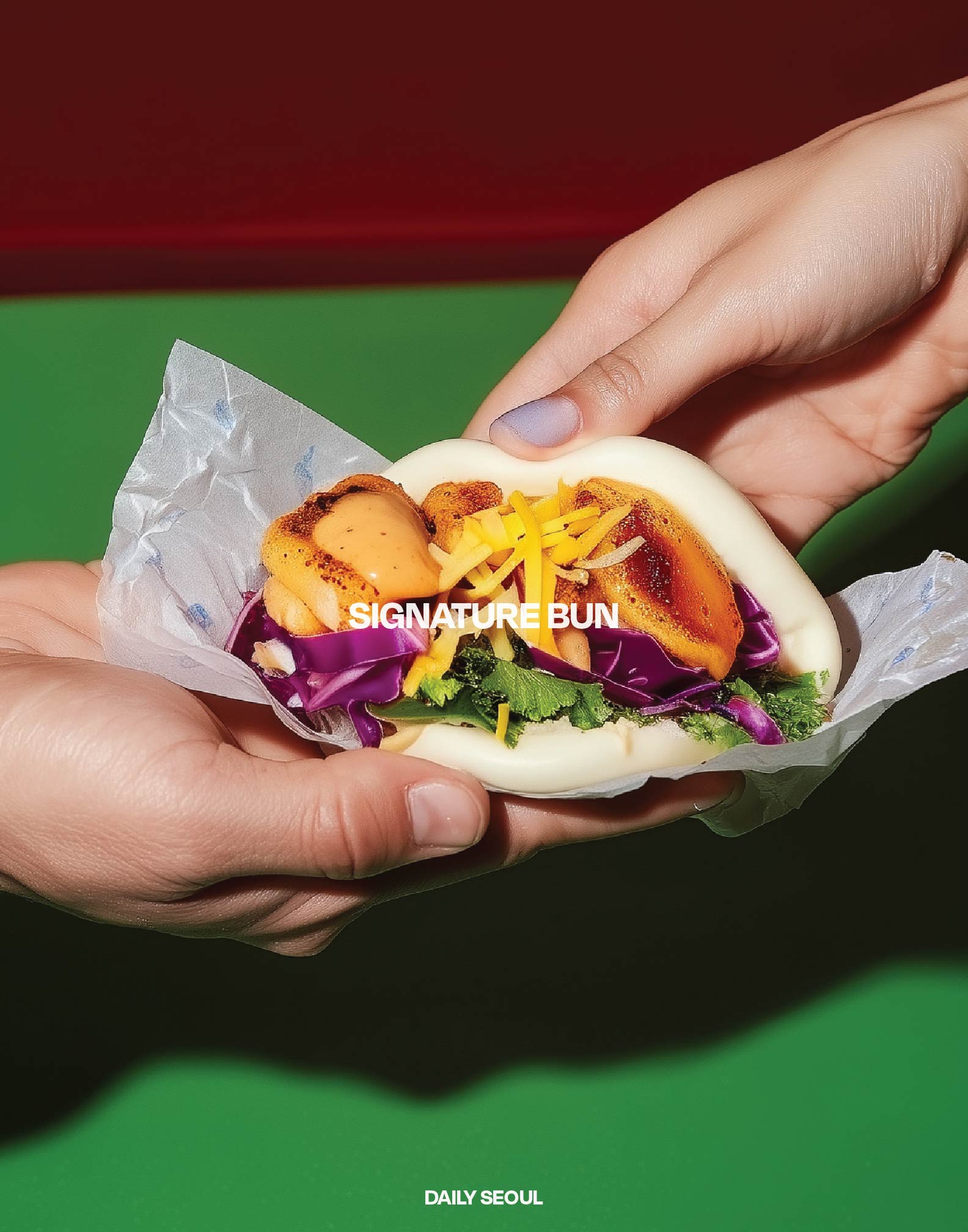
Every touchpoint, digital and physical was designed and produced by me.
Logo & brand identity system
Food & concept photography
Menu design
Poster design
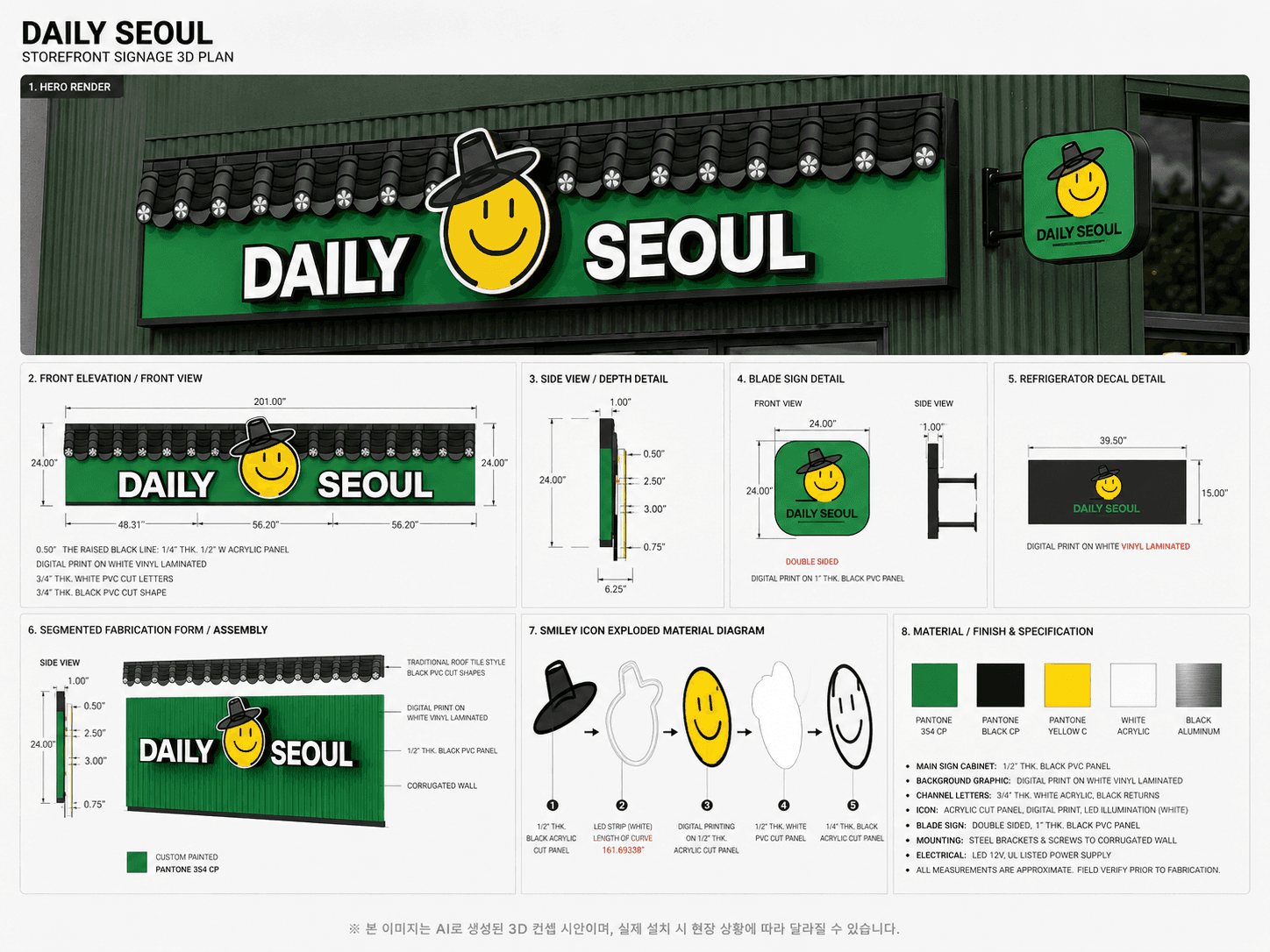
Signage & environmental design
Table banners
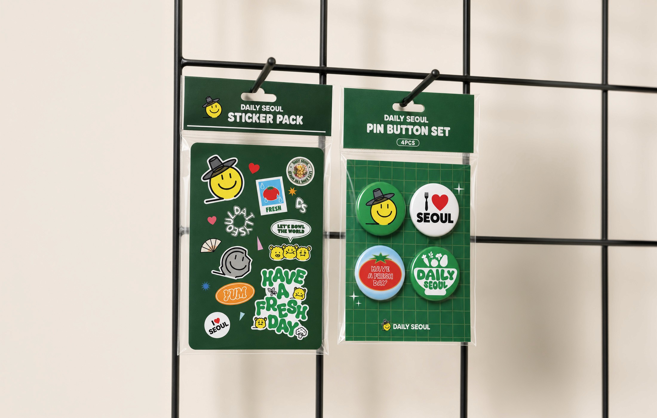
Packaging
Uniforms & merchandise
Social media (Instagram)






Seasonal campaign
FIFA Season Campaign - American Dream Mall, NJ
After the brand launched, I continued evolving it through seasonal moments. For the FIFA gaming season, I created a one-month campaign for the American dream mall location, keeping the Daily Seoul identity intact while bringing in a fresh, sport-themed energy.


Process
Designing with many voices
As the only designer, I had to synthesize input from the restaurant owner, VP, president, and team, all with different aesthetic instincts, into a single coherent brand. This meant running multiple rounds of direction-setting before execution, and continuing to iterate even after launch based on sales performance.


Multiple concepts were explored across several rounds of stakeholder review before landing on the final direction.
Results
From one location to three, in under a year
Daily Seoul launched at H Mart's American Dream Mall flagship. Within less than a year, the brand expanded to two additional company-owned locations: Fairfax, Virginia and Cherry Hill, New Jersey.
3
Locations in under a year
NJ → VA
Multi-state expansion
1
Designer behind the entire brand